As described in the last post, the probabilities obtained from classification algorithms can be used directly for evaluation or by setting a threshold for the same. In this post, I will be describing how to use probabilities directly for evaluation with changing value of threshold. These methods involve looking at certain graphs -
Lift and Cummulative Gain Charts
Let’s take an example of a survey. In the data, we have a survey sent out to 1000 users out of which we received 100 responses. The objective is to build a classification model to predict who is going to respond to the survey in order to reduce the cost of sending out the surveys that remain unanswered and increase the response rate. In this scenario, the decision of how many people should receive the survey will be made based on the business objective and the spend amount available with the team conducting the survey. One way to analyze the situation would be through the use of Lift and Gain Charts.
For this, first we have to sort the users based on the score obtained from the model in descending order. Now, we make a plot. On the X-axis we are going to represent, what percentage of people will receive the survey while on the Y-axis, we will represent what percentage of the actual responders have been identified. The graph would look something like this -
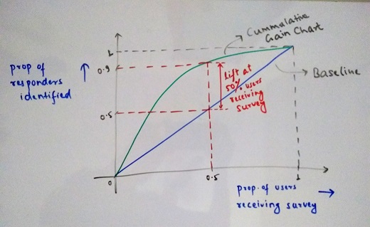
The blue line represents random sampling distribution of responders in absence of a model and is considered to be the baseline. This means if we send out survey to 50% of the users (500 in this case), we receive 50% of the total responses (50 in this case). If we look at the model results (Green Line), we are able to identify 90% of the users. The gap between the random sampling and the model result gives us the lift i.e the extra responders we are able to identify because of our model. This is known as Cummulative Gain Chart.
From this, we can draw another plot representing the lift we get as we move towards sending surveys to higher no. of people.
Lift = Percentage of responders identified with model / Percentage of responders expected with random sampling
Below is the Lift Chart for the reference -
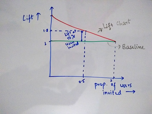
Using both these charts, the business can take decisions of how many users should actually be sent the surveys based on their constraints or flexibility allowed.
AUC(Area Under the ROC Curve)
For this, we need to look at 2 metrics, TPR(True Positive Rate) and FPR(False Positive Rate). The Notations remain same with respect to the Confusion Matrix described in the last post. Evaluation of Classification Algorithm-Part1
TPR = TP / (TP + FN) - This represents the percentage of responses identified out of all the responses. It is also commonly known as Recall or Sensitivity.
FPR = FP / (TN + FP) - This represents the percentage of Non-responses categorized as responses. This is also equal to (1-Specificity).
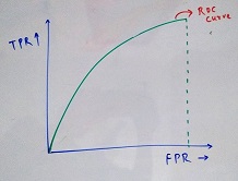
The plot between TPR and FPR is called ROC Curve (Receiver operating characteristic) and the area under this curve is known as AUC-ROC. The value for this varies between 0 and 1. The higher the value, the better our model is able to distinguish between the responses and Non-Responses. Below is a sample plot -
In order to get understand, how exactly does this curve works, let’s go a little deeper. The distribution of response and Non-response obtained from the model is what affects the outcome plot. Below are some scenarios for this -
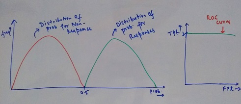
In the above case, all the responses have their probability above a certain threshold while all the non-responses have their probability less than the threshold. Here, as we keep on increasing the threshold value to check TPR and FPR, we do not find any response observation misclassified as Non-response, hence, the TPR is always 1. For eg - if the Threshold if 0.25 => TPR = 1, FPR = 0.5 as half of Non-response are classified as Response. When we reach the ideal threshold of 0.5, both TPR and FPR is 1. This is an ideal scenario which you will never encounter in the real world data.
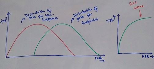
In the above scenario, there is no clear boundary which helps us classify both the cases. This is a much more realistic example of how a typical classification model output would look like and the area under this curve should be as high as possible.
I hope this clarifies the evaluation aspect of classification algorithms.